
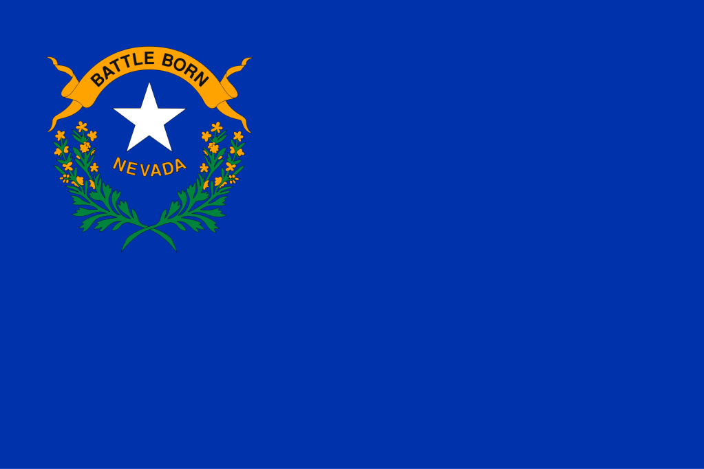
This is, in my opinion, the worst flag in the United States. But I guess, like the Chicago Cubs, Nevada had some bad luck with designing flags. Take a look at this:
Yeah. So, let’s look at the flag.
First of all, they used blue with some kind of seal, which isn’t even an original design. But then, they didn’t even bother putting it in the center! So they have a design half of all states have, and they (probably) forgot to center it! That is very lazy.
In conclusion, this flag is not good, and it demonstrates that by using two kinds of laziness. I hope that in the near future (or whatever future) they redesign this rather disappointing flag.
—WHAT’S THE NEXT GOOD FLAG?—
If you don’t know how the hint system works, please see Niue.
Your hint is…

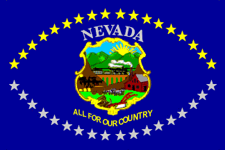
Bring back the 1905-1915 version!
LikeLike
Their 1905 flag was the best of their best flag, in my opinion. They should bring that back and then it would be a cool vintage story!
LikeLike
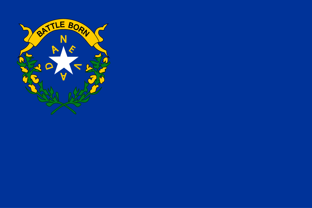
I do like what you’re trying to convey, but I thought that was bad because they just had the word “NEVADA” written across the middle
LikeLike