
So when looking at this flag first, my initial thought is, “MY EYES!”
No, seriously. But we’ll get to that later.
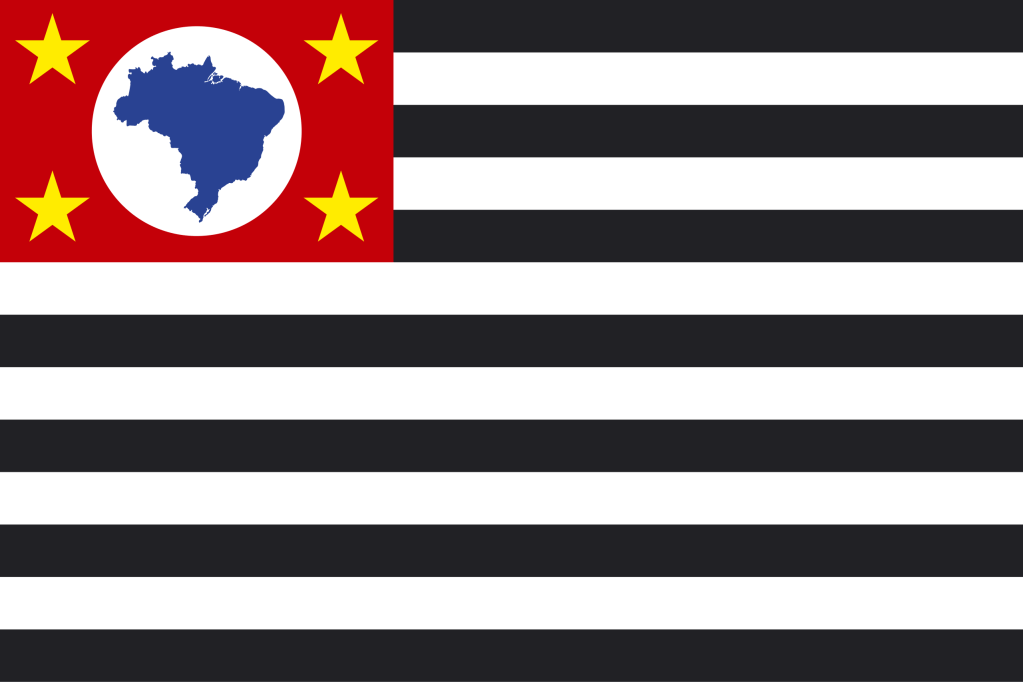
First of all, we have stripes and stars. While the rectangle in the upper-left corner isn’t big or blue, and there aren’t 50 white stars, there are 13 stripes. And (if you were really blind) you could confuse it with a rather particular flag of a very famous country that even their own government has written about.
So let’s look at the canton (the fancy flag word for that box).
We have four yellow stars, and a white circle with the Brazil map on it. Already we’re off to a bad start because putting a map of a country on a flag is not a good thing to do. But the rest of the canton isn’t too bad.
Alright, now we come to the stripes.
Black and white are not good color combination sometimes. Especially in stripes, where it looks like a stereotypical criminal suit. That’s not good because it could be interpreted that your state has the highest crime rate in Brazil (But you can rest easy, Pernambuco has the highest murder rate). It’s also an eyesore.
Overall, this flag is not good and can even be misinterpreted. Hopefully the city of São Paulo will have a better fla–

…oh.
–WHAT’S THE NEXT GOOD FLAG?–
Yer hint is..
IT DEPENDS ON WHAT YOU THINK MAKES A COUNTRY OR NOT, BUT EITHER ASIA OR CHINA
See you on Tuesday! (and no, it’s not Hong Kong)

I actually kind of like this flag but I do agree, the country image needs to be removed. The black and white contrast is bold & really makes a statement, I like that. But you’re the expert😉
LikeLike
The stripes confuse my eyes. 👀 It hard for me to focus and then see the detail in the left corner. I agree…update the flag, please.
LikeLike