This flag I don’t really have much to say on. But I need to have a post that’s longer than my previous one in terms of text, so yeah.
We’ll just skip the colors, which are blue and what kinda looks like highlighter yellow.
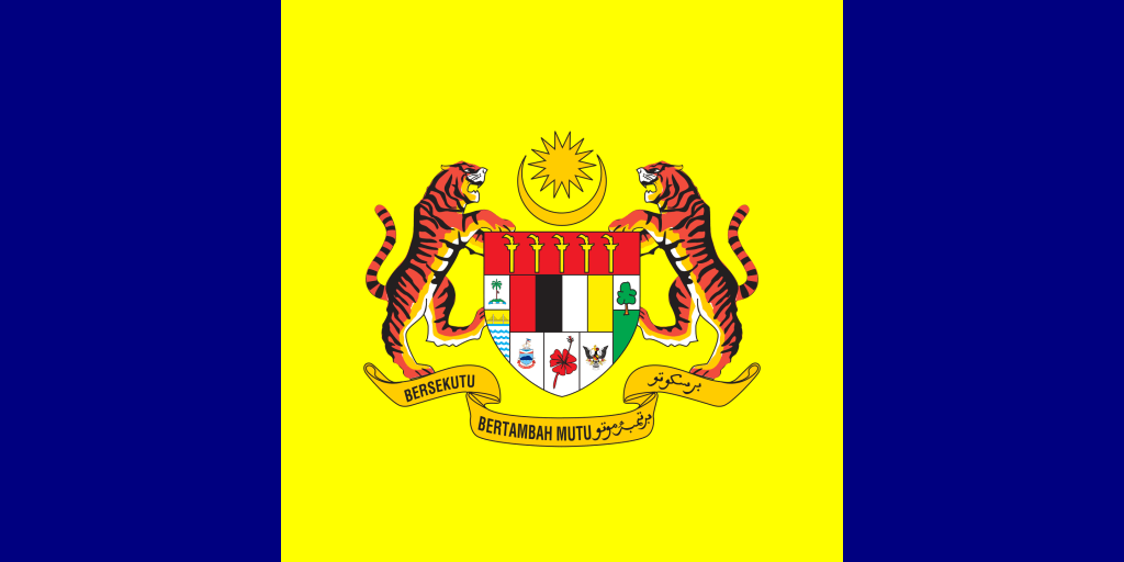
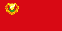
In the seal in the center, we have two tigers, which are a.w.e.s.o.m.e.s.a.u.c.e.r.s. But there are a whole load of other stuff, so let’s get to those.
So down there, in the ribbons, we have a motto, and I guess they couldn’t decide on a language, so they split it down the middle. Imagine writing a normal sentence with that style there!
Then we have what appears to be a floating coconut tree on a beach, a cruise ship, a red four-leaved clover, a copy of the USA’s emblem, a poorly-drawn tree, five weird swords, and I think they just ran out of ideas, so they ended it on red, black, white, and yellow. I don’t know what to say about the sun.
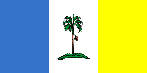
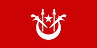
Oh, and just so you don’t go off thinking this is the worst flag, here’s the competition:
–SCORE–
To simplify things, I will be reverting the score from 1 (good) to 10 (bad) to 1 (bad) to 10 (good).
| SIMPLICITY | 3/10 |
| MEANINGFUL SYMBOLISM? | 4/10 |
| 2 OR 3 COLORS? | No (0/10) |
| LETTERING/SEALS? | No (0/10) |
| DISTINCTIVENESS/REALTEDNESS | 2.5/10 |

Wikipedia says the motto means “Strength in Unity”, but the translate app says it means “Associates Increase Quality”.🤷♂️
LikeLike
This is definitely official
LikeLike
thanks for pointing out the split language on the ribbon – I missed that!
LikeLike
The tigers are the best part of the flag, I think. If the yellow was a softer color it might not hurt my eyes.
FYI – I do like the new scoring!
LikeLike