
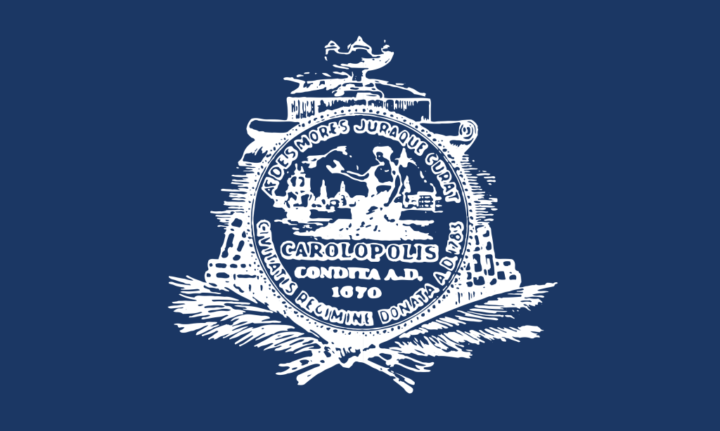
There is a whole load of things wrong with this flag.
First up, we have the duotone color scheme. The white usage on this flag makes it looks like it’s a stamp, not a flag for a famous city…
Secondly, ‘Carolopolis’???? While I was downloading the flag, I happened to notice this word etched in the center. Carolopolis is only a word applied to good homes in the town. It would make a lot more sense if it said ‘Charles Town’ on that!
And finally, I have been to Charleston before, and I am disappointed there is NO reference to Fort Sumter or Angel Oak.

I agree you, surprised there is no reference to Fort Sumter.
Have you ever thought of doing the Key West, FL flag?
LikeLike
you are right, so much history to choose from. Charleston should try again. 🙂
LikeLike