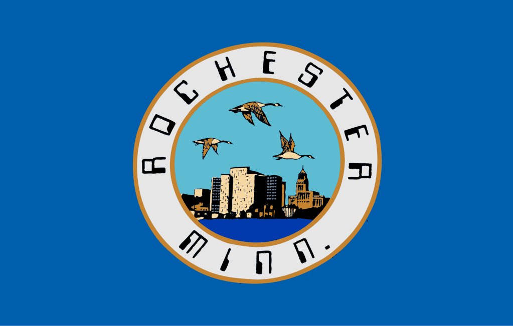
I can see three things wrong with this flag.
First, there is a seal, and you already know how I feel about those…
Second, they didn’t even bother making the seal a perfect circle, and just an awkward oval.
And finally, we have the strange, 70s computer font text around the image in the center (although it does make sense because the flag was made in the 80s…).
There is, however, a sliver of hope for the flag, because there is a movement to help change the flag to something much better, and when residents of Rochester are informed about it, their first response may be, “Huh?” (or at least, that’s what the website says).
This is the new design:

So please, government of Rochester, change the flag to this ASAP!

The flag does need to be updated, but what does the new flag mean? It looks good. I was just wondering what it represents.
LikeLike