
While I assume Albuquerque is a wonderful place (Weird Al fans will remember this town), its flag is not.
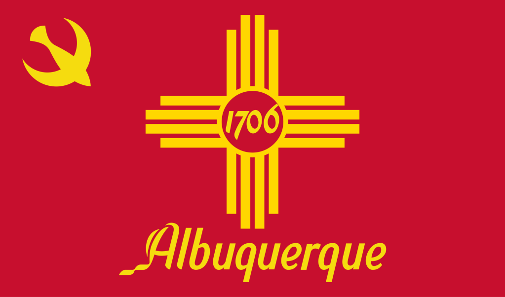
First, we have the Zia sun symbol on the flag, and it makes it look like Albuquerque just zoomed in on New Mexico’s flag and reversed the colors. Not very good.
Then we have the text below, and that makes it look casual, like the font you’d find on a semi-urban high school football team logo. The ‘1706’ in the dead center doesn’t help either (and frankly, it never did).
Then we have the thunderbird in the top left. It is unnecessary to put the bird in the top left, you could’ve put it in the center and kicked out the 1706. It also could be mistaken for a pen with a huge smile. Or a missile skimming past a crescent moon. Or, especially because of the placement, it could be mistaken for a signature icon on a notorious former country’s flag…
